Cursive Initial Necklace Buying Guide: What to Look For
Discover what to look for when buying a cursive initial necklace. Expert tips on metals, chain lengths, font styles, and pricing for personalized jewelry.

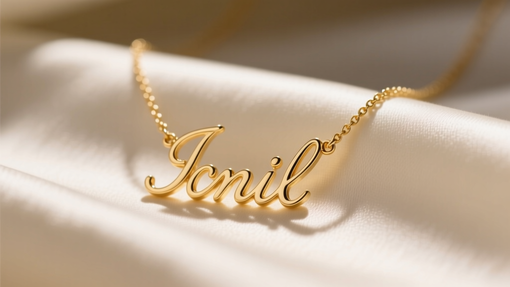
The Enduring Appeal of Script Jewelry
Cursive initial necklaces bridge the gap between deeply personal sentiment and everyday elegance. Unlike block-letter pendants, script fonts introduce fluid lines, loops, and varying stroke widths that mimic handwriting. Historically, personalized jewelry was dominated by heavy signet rings, but modern casting techniques have allowed the intricate art of calligraphy to be translated into delicate, wearable necklaces. However, these very characteristics introduce unique structural vulnerabilities. When shopping for a cursive initial necklace, understanding the intersection of typography and metallurgy is critical to ensuring your piece survives daily wear. This comprehensive buying guide breaks down the exact specifications, material grades, and design nuances you need to evaluate before making a purchase.
Decoding Metal Choices and Durability
The longevity of a script pendant relies heavily on its base metal. Because cursive fonts feature thin stems and delicate connecting serifs, softer metals can easily bend or warp out of shape. Here is how the most common jewelry metals perform when crafted into delicate script jewelry.
| Metal Type | Durability for Scripts | Average Price Range | Best For |
|---|---|---|---|
| 925 Sterling Silver | Moderate (prone to bending on thin stems) | $35 - $85 | Occasional wear, budget-conscious buyers |
| Gold Vermeil | Moderate (core is sterling silver) | $60 - $120 | Daily wear with proper care |
| Solid 14k Gold | High (excellent tensile strength) | $250 - $600 | Lifetime daily wear, heirloom gifts |
| Solid 18k Gold | Low-Moderate (softer alloy, higher bend risk) | $400 - $900+ | Special occasion, rich color preference |
When considering gold vermeil, always verify the plating thickness. According to the Federal Trade Commission, genuine vermeil must feature a sterling silver base plated with at least 2.5 microns of gold. Anything less is considered standard gold plating and will quickly wear away on high-friction areas like necklace pendants.
For solid gold, the Gemological Institute of America (GIA) notes that 14k gold contains 58.5% pure gold, alloyed with metals like copper and zinc. This specific alloy mix provides the exact tensile strength required to keep thin cursive stems from warping when caught on clothing, making it the superior choice for intricate script designs.
Chain Selection: Gauge, Style, and Clasp Mechanics
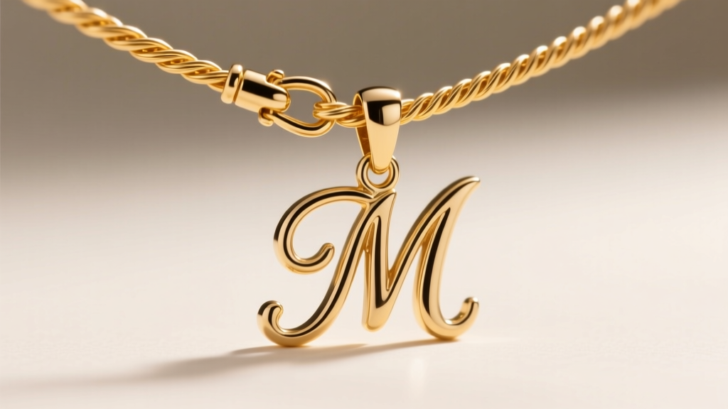
The chain you pair with a cursive initial necklace is just as important as the pendant itself. A chain that is too thick will overpower the delicate typography, while a chain that is too thin will inevitably snap under the pendulum-like swinging motion of the pendant.
The Sweet Spot: 1.0mm to 1.2mm Thickness
For standard cursive pendants weighing between 1.5 and 3 grams, a chain thickness of 1.0mm to 1.2mm is the structural sweet spot. Avoid 0.8mm chains; the jump ring connecting the pendant to the chain will slowly warp into an oval shape from friction, eventually leading to a break. The constant rubbing of the jump ring against the chain links acts like a tiny saw, so ensuring adequate metal thickness is vital for longevity.
Cable vs. Box Chains for Script Pendants
- Cable Chains: The classic choice. However, the small oval links can occasionally catch on the open loops of cursive letters like 'e' or 'o' if the pendant flips backward.
- Box Chains: Featuring smooth, square links, box chains lay flat against the collarbone and are highly resistant to tangling in script flourishes. They are the preferred choice for highly ornate cursive fonts.
Clasp Security
Always opt for a lobster clasp over a spring ring clasp. Spring rings are notoriously difficult to operate with one hand and possess a weaker internal spring mechanism that fails frequently. A 5mm or 6mm lobster clasp provides a secure lock and balances the visual weight of the chain.
Font Anatomy: Navigating Script Flourishes and Solder Points
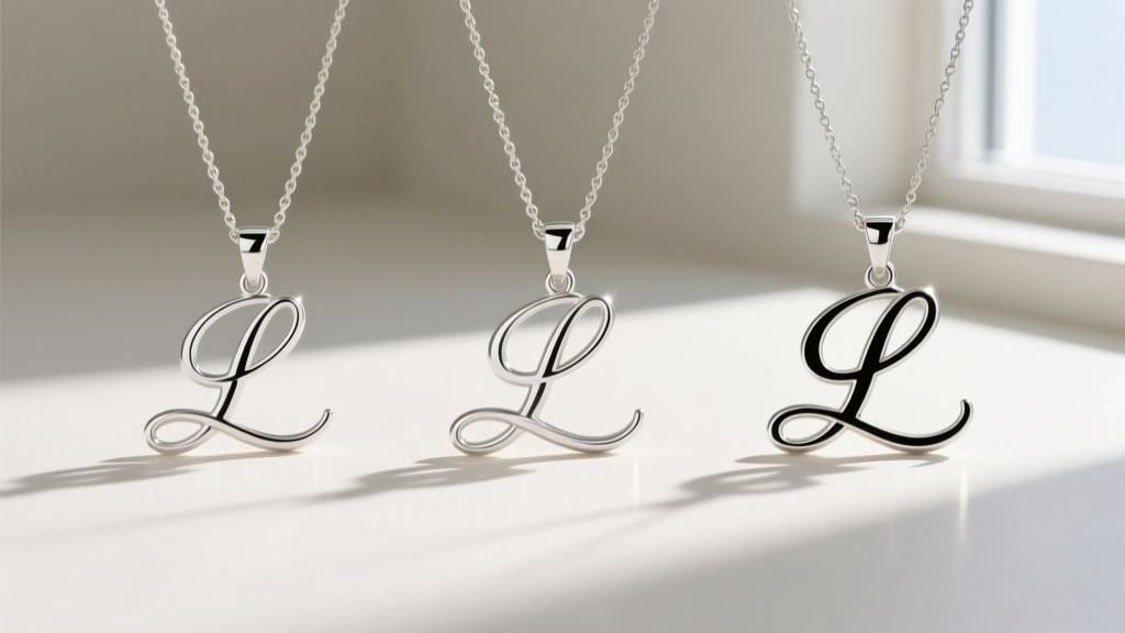
Not all cursive fonts are created equal in the realm of jewelry manufacturing. The transition from a digital font file to a cast metal pendant introduces physical limitations that buyers must scrutinize.
The Flourish Problem
Letters with extensive flourishes—particularly lowercase 'f', 'g', 'j', 'y', and 'z', or uppercase 'L' and 'S'—feature protruding tails. If these tails are left as open, wire-like extensions, they will act as hooks, catching on knit sweaters, scarves, and hair. When evaluating a cursive initial necklace, look for designs where the flourishes are either tucked back into the main body of the letter or thickened to resist bending.
Solder Joint Integrity
In many cursive designs, the loops of the letters are closed to improve structural integrity. This requires the jeweler to use micro-soldering to connect the ends of the metal loop. Inspect product macro-photography to ensure these solder joints are smooth and flush. A visible bump or dark line at the connection point indicates poor finishing, which can lead to the loop snapping under tension.
Expert Tip: If you are purchasing a letter with a complex closed loop (like a lowercase 'e' or 'a'), ensure the manufacturer uses laser welding rather than traditional torch soldering. Laser welding provides a stronger, cleaner joint on delicate 14k gold scripts without melting the surrounding thin stems.
Proportions, Sizing, and Neckline Pairing
Scale is the difference between a sophisticated piece of fine jewelry and a pendant that looks like costume accessories. For adult women, the ideal height for a cursive initial pendant falls between 15mm and 22mm. Pendants exceeding 25mm in height often look clunky and disrupt the elegant flow of the script.
Width is equally important. Letters like 'W' or 'M' require horizontal scaling considerations so they do not look too wide and hit the collarbones awkwardly. A well-designed script pendant maintains a balanced aspect ratio, ensuring the letter remains legible without dominating the neckline.
When selecting chain length, consider your most common necklines:
- 16-Inch Chain: Sits perfectly on the collarbone. Ideal for V-necks, scoop necks, and open-collared blouses. This length keeps the cursive initial centered and highly visible.
- 18-Inch Chain: Drops just below the collarbone. Better suited for crew necks, turtlenecks, or layered necklace stacks where the initial pendant needs to rest below a shorter choker or chain.
Pricing Tiers and Market Expectations
Understanding the fair market value of a cursive initial necklace prevents you from overpaying for inferior materials. Pricing is dictated primarily by metal weight, alloy purity, and the addition of gemstone accents.
- Entry-Level ($35 - $90): Typically 925 sterling silver or gold-plated brass. Expect thinner font strokes and mass-produced, generic script fonts. These are suitable for gifts but lack longevity.
- Mid-Tier ($150 - $350): High-quality gold vermeil or lightweight solid 10k/14k gold. You will find better clasp hardware, reinforced solder joints, and more unique, bespoke font options.
- Fine Jewelry Tier ($400 - $800+): Solid 14k or 18k gold with substantial metal weight. This tier often includes conflict-free diamond accents embedded within the cursive stems and custom hand-engraved flourishes.
Care, Maintenance, and Troubleshooting
Cursive initial necklaces require specialized care due to their intricate geometry. The varying thickness of the script stems means that dirt and lotion easily accumulate in the tight inner curves of the letters.
What to Avoid
Never place a delicate script pendant in an ultrasonic jewelry cleaner. The high-frequency cavitation bubbles can easily fracture the micro-solder joints connecting the cursive loops, causing the letter to literally fall apart. Similarly, avoid chemically treated silver polishing cloths on gold vermeil script necklaces, as the harsh compounds can strip the gold plating and leave the thin stems looking dull and gray.
The Proper Cleaning Method
To clean your cursive initial necklace, prepare a bowl of warm water with a few drops of mild, phosphate-free dish soap. Let the necklace soak for five minutes. Then, use a soft-bristled baby toothbrush to gently agitate the soap into the tight loops and curves of the script. Rinse thoroughly under lukewarm tap water and pat dry with an untreated, lint-free microfiber cloth. Always apply perfumes, hairsprays, and lotions before putting on your necklace to protect the metal finish, and store the piece flat or hanging to prevent the chain from threading through the pendant loops.


