Troubleshooting Real Jewelry Over a Necklace Tattoo Design
Got a necklace tattoo design? Learn how to troubleshoot visual clutter and perfectly layer real pendants and chains over collarbone and sternum ink.

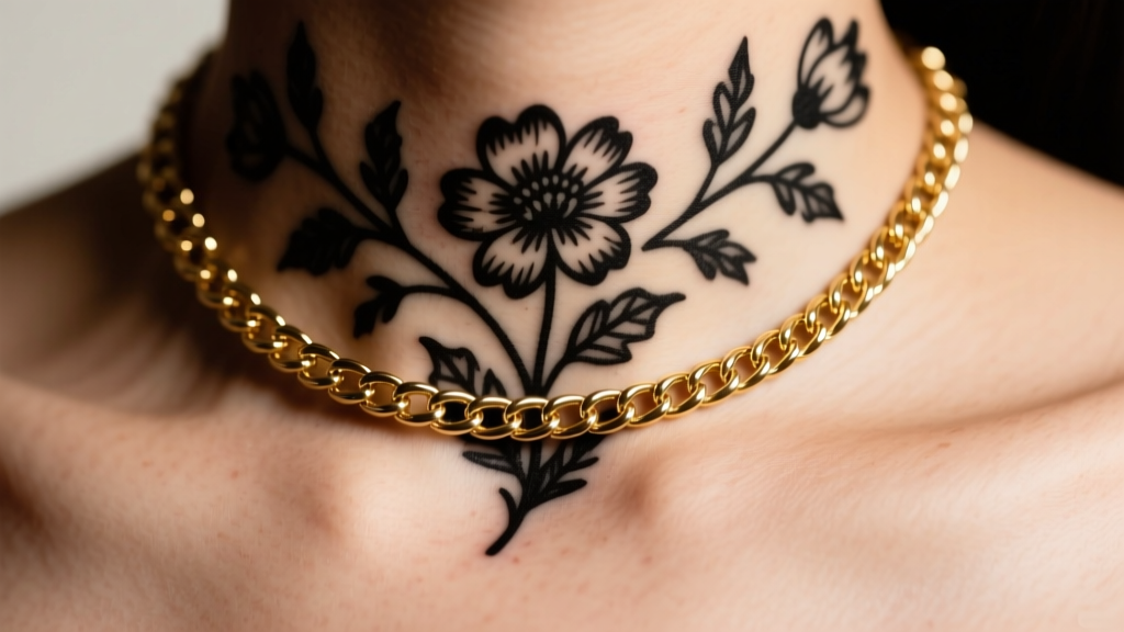
The allure of permanent jewelry has led thousands to opt for a necklace tattoo design etched directly into their collarbones, sternum, or nape. But what happens when you still want to wear your favorite gold pendants, layered chains, or statement lockets? The result is often a visual collision. Real jewelry and permanent ink compete for the same anatomical real estate, leading to cluttered necklines, hidden pendants, and a chaotic aesthetic.
As jewelry stylists, we frequently troubleshoot this exact layering failure. The secret to harmonizing a necklace tattoo design with physical chains lies in understanding visual weight, negative space mapping, and metal-to-ink color theory. Below is our comprehensive troubleshooting guide to solving the most common clashes between your permanent ink and your physical jewelry box.
Diagnosing the Visual Clash: Moiré and Weight Failures
Before adjusting your chains, you must identify why the current pairing looks "off." Most styling failures over a necklace tattoo design stem from two specific optical illusions:
- The Moiré Effect: When the repeating geometric pattern of a physical chain (like a 2.5mm box chain) overlaps with the stippling or fine-line hatching of a tattoo, it creates a vibrating, blurry optical illusion. This makes both the jewelry and the ink look messy.
- Visual Weight Imbalance: A heavy blackwork tribal or gothic necklace tattoo design carries massive visual gravity. Pairing it with an ultra-fine 0.8mm thread chain causes the chain to disappear entirely, while pairing it with a thick 6mm Cuban link creates an overwhelming, top-heavy look that distracts from the face.
"Skin is a dynamic canvas. When layering metals over healed ink, you must treat the tattoo as a foundational garment rather than a blank space." — Editorial Jewelry Styling Guidelines
Troubleshooting by Anatomical Placement
The physical location of your ink dictates the exact chain length and clasp type you should deploy to avoid overlap friction and visual noise.
The Collarbone Zone (14 to 16 Inches)
Collarbone tattoos are the most common iteration of the necklace tattoo design. Because standard princess-length necklaces (18 inches) rest directly on the collarbone, they will slice right through the center of your ink. The Fix: Opt for a 13-inch choker that sits strictly above the tattoo in the negative space of the lower neck, or drop down to a 20-inch matinee chain that rests below the ink on the upper sternum. Never wear an 18-inch chain directly over a dense collarbone piece.
The Sternum and Underboob Zone (18 to 24 Inches)
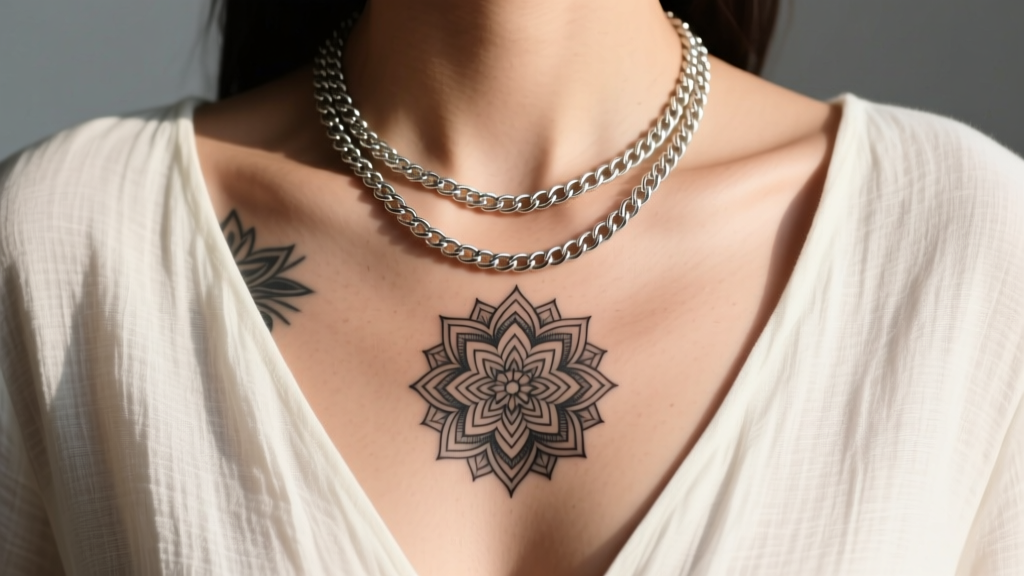
Sternum tattoos require deep V-necks or open button-downs to be visible. The troubleshooting issue here is pendant swing. A heavy pendant on a 22-inch chain will physically strike the most sensitive, detailed parts of a sternum necklace tattoo design when you walk. The Fix: Use stationary station chains (like a 20-inch diamond-cut rope chain with soldered bezel-set gems) that distribute weight evenly and prevent a single heavy pendant from swinging and obscuring the ink's focal point.
The Chain Gauge vs. Ink Density Matrix
To eliminate the Moiré effect and balance visual weight, use this troubleshooting matrix to match your physical chain gauge to your tattoo's saturation level.
| Tattoo Ink Style | Ideal Chain Width | Recommended Chain Types | What to Avoid |
|---|---|---|---|
| Fine-Line / Single-Needle | 1.0mm - 2.5mm | Cable, Box, Wheat | Thick Curb links (crush the delicate aesthetic) |
| Gray Wash / Watercolor | 1.5mm - 3.0mm | Rolo, Figaro, Snake | Highly reflective diamond-cut chains (cause glare over soft ink) |
| Dense Blackwork / Solid | 3.5mm - 5.0mm | Cuban, Rope, Mariner | Ultra-thin thread chains (will visually vanish against dark ink) |
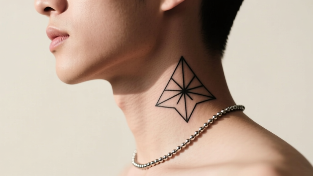
| Geometric / Dotwork | 2.0mm - 4.0mm | Smooth Herringbone, Flat Box | Patterned chains like Singapore or Byzantine (triggers Moiré effect) |
Color Theory: Matching Metal Alloys to Ink Saturation
The metallurgical composition of your jewelry drastically alters how the human eye perceives the ink beneath it. According to the Gemological Institute of America (GIA), the alloy mix in gold changes its reflective properties, which in turn changes the contrast against your skin and ink.
- 14k Yellow Gold: The high copper and silver alloy mix gives yellow gold a warm, reflective glow. This is the ultimate troubleshooting fix for cool-toned black ink. The warmth of the gold creates a striking, high-contrast border that makes a blackwork necklace tattoo design pop without blending into it.
- 18k Rose Gold: With a higher copper content, rose gold offers a muted, earthy tone. This is highly recommended for botanical, fine-line, or red-ink tattoos. It harmonizes rather than competes.
- Platinum and White Gold: These cool, highly reflective metals are notorious for getting "lost" in gray-wash tattoos. If you must wear white metals over a gray necklace tattoo design, ensure the chain features high-polish, diamond-cut facets to catch the light and separate the metal from the ink.
3-Step Troubleshooting Framework for Daily Wear
When getting dressed, run through this rapid diagnostic framework to ensure your jewelry and ink coexist peacefully.
- Map the Negative Space: Look in the mirror and identify the uninterrupted skin between your tattoo and your neckline. If the gap is less than 1 inch, abandon pendants entirely and opt for a bare, smooth herringbone chain that acts as a metallic frame rather than an overlapping element.
- Check the Bail and Jump Ring: According to the American Academy of Dermatology, healed tattoos can sometimes have slight textural variations. Large, ornate pendant bails can catch on clothing and drag across the ink awkwardly. Swap standard pendants for those with soldered, flush jump rings that lay flat against the sternum.
- The Pendant Drop Test: Hold your pendant against your chest. Does the bottom edge of the gemstone or metal drop directly into the darkest, most detailed focal point of your necklace tattoo design? If yes, remove the pendant. Let the chain act as a standalone frame.
When to Abandon the Pendant: Embracing Minimalist Bands
Sometimes, the most advanced troubleshooting step is subtraction. If your necklace tattoo design features intricate mandalas, dense floral arrangements, or heavy gothic lettering, adding a physical pendant is a losing battle. The eye will not know where to rest.
In these scenarios, pivot to minimalist, pendant-free bands. A 2mm flat box chain in 14k solid gold, worn at a length that perfectly parallels the top edge of your tattoo, creates a deliberate, curated "double-necklace" illusion. This approach respects the artistry of the permanent ink while still allowing you to participate in the tactile luxury of wearing fine jewelry. By treating your necklace tattoo design as the primary pendant and your physical chain as the framing device, you achieve a flawless, high-fashion layering effect that looks intentional, not accidental.


