Styling Alphabet Characters in the Necklace: 2026 Pendant Trends
Discover 2026 trends for styling alphabet characters in the necklace. Expert guide on typography, metal grades, chain pairings, and layering.

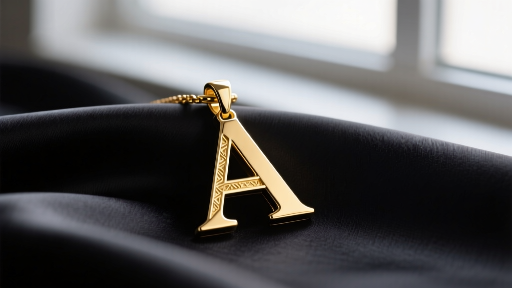
The landscape of personalized jewelry has undergone a radical transformation. Gone are the days when a simple, mass-produced nameplate was the pinnacle of self-expression. As we navigate the 2026 style landscape, the integration of specific characters in the necklace design has evolved into a sophisticated study of typography, metallurgy, and modular styling. Whether you are opting for a single, diamond-encrusted serif initial or a stack of interchangeable runic glyphs, understanding the nuances of letter-based pendants is essential for the modern collector.
The Evolution of Personalization: Beyond the Nameplate
According to market analyses highlighted by Forbes, the personalization economy in luxury goods has shifted from overt branding to hyper-individualized, quiet luxury. In the realm of neckwear, this translates to a preference for single, typographically significant characters in the necklace rather than full names. The modern consumer views their initial or a loved one's letter not just as a monogram, but as a standalone sculptural element.
This shift has forced jewelers to treat alphabet letters with the same architectural rigor as traditional gemstone settings. The crossbar of an 'E' or the sweeping descender of a 'y' is now a canvas for micro-pavé diamond work, mixed-metal inlays, and bespoke enamel guilloché. The focus is on the negative space within the letterform and how light interacts with the metal's bevels.
2026 Trend Report: Typography Meets Metallurgy
The Resurgence of the Modern Serif
Minimalist sans-serif fonts dominated the late 2010s, but 2026 marks the triumphant return of the modern serif. Think of the high-contrast strokes of a Didot or Bodoni typeface translated into solid 14k gold. The thick-and-thin line variation of serif characters in the necklace pendants provides a dynamic visual weight that catches the light beautifully. However, crafting thin serif points (like the tips of an 'A' or 'V') requires advanced CNC milling or high-pressure casting to prevent porosity and ensure the delicate points do not snap under daily wear.
Mixed-Metal Inlays and Gemstone Accents
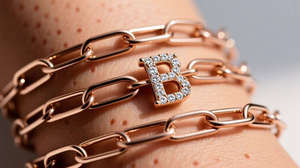
Jewelers are increasingly combining metal tones within a single character. A popular 2026 technique involves casting the primary letter in 18k yellow gold while inlaying the inner negative space with oxidized titanium or white gold. When incorporating diamonds into these typographic designs, adherence to quality standards is vital. According to the Gemological Institute of America (GIA), melee diamonds (those under 0.20 carats) used in pavé settings on letter pendants typically range from SI1 to I1 clarity and G-H color. Because the stones are microscopic (often 0.01 to 0.02 ctw each), the precision of the micro-prong or bead setting is far more critical to the pendant's brilliance than the raw grade of the diamond itself.
Material Grades and Durability for Letter Pendants
When selecting the metal for your typographic pendants, durability and skin chemistry must dictate your choice. The sharp angles and high-friction edges of alphabet characters in the necklace designs are prone to wear.
- 14k Solid Gold (58.5% Purity): The gold standard for serif and intricate script fonts. The alloy mix (usually copper and silver) provides the tensile strength needed to maintain sharp, delicate typographic points without bending.
- 18k Solid Gold (75% Purity): Offers a richer, warmer hue but is inherently softer. Best reserved for chunky, block-letter sans-serif designs or gothic blackletter pendants where the metal volume is substantial.
- Heavy Vermeil (2.5+ Microns): If opting for gold over sterling silver, ensure the vermeil plating is at least 2.5 microns thick. Standard flash plating (0.5 microns) will quickly wear off the raised edges of the letterforms due to friction against clothing and skin.
- 316L Surgical Steel: An excellent, hypoallergenic budget alternative that can be PVD-coated in 14k gold tones. PVD coating is highly resistant to the micro-abrasions that occur on the sharp corners of initial pendants.
Chain Pairing Matrix: Matching Characters to Links
The typography of your pendant must dictate the chain it hangs from. A heavy gothic letter will snap a delicate cable chain, while a minimalist sans-serif will be visually swallowed by a thick Cuban link. Use the framework below to perfectly balance your characters in the necklace stack.
| Typography Style | Ideal Chain Pairing | Recommended Metal | 2026 Price Range (USD) |
|---|---|---|---|
| Modern Serif | 1.2mm Cable Chain | 14k Yellow Gold | $350 - $600 |
| Minimalist Sans-Serif | 1.5mm Box Chain | Platinum / 18k White Gold | $500 - $950 |
| Gothic / Blackletter | 2.0mm Figaro Chain | Oxidized Sterling Silver | $120 - $250 |
| Fluid Script | 1.0mm Rope Chain | 14k Rose Gold | $280 - $450 |
The Modular Movement: Interchangeable Character Systems
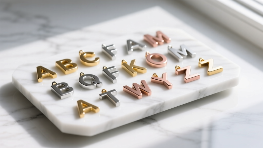
One of the most exciting functional trends of 2026 is the rise of modular initial jewelry. Instead of purchasing a fixed pendant, consumers are investing in specialized carrier chains equipped with micro-lobster clasps or hidden screw-thread mechanisms. This allows the wearer to swap out different characters in the necklace depending on their mood, outfit, or to honor different family members throughout the week. When purchasing modular systems, always check the internal diameter of the character's bail (the loop at the top). A standard 1.5mm box chain requires a bail opening of at least 2.0mm to ensure the letter hangs flush and does not pinch the chain links.
Styling Frameworks: How to Layer Initial Pendants
Layering alphabet pendants requires a strict adherence to spatial geometry to prevent the letters from tangling and scratching one another. The golden rule for stacking characters in the necklace formats is the 2-4-6 drop rule:
The 2-4-6 Drop Rule: Start with a 14-inch choker (often a simple gemstone or plain chain), follow with a 16-inch chain holding your primary initial pendant, and anchor the stack with an 18-inch or 20-inch chain featuring a secondary, heavier character or a geometric counterweight. This 2-inch variance ensures the metal edges never overlap during movement.
Furthermore, avoid pairing two highly detailed serif initials of the exact same millimeter width. If your primary 'M' pendant is 15mm tall, your secondary layered initial should be either significantly smaller (8mm) or feature a contrasting texture, such as a hammered or matte-brushed finish, to create visual hierarchy.
Final Verdict on the Character Pendant Movement
The integration of typographic characters in the necklace repertoire is no longer a fleeting trend; it is a permanent pillar of fine jewelry styling. By prioritizing structural integrity in thin serif points, demanding high-micron vermeil or solid alloys, and treating the chain as an equal partner to the pendant, you can curate a personalized stack that is as durable as it is deeply meaningful. As 2026 progresses, expect to see even more boundary-pushing collaborations between master typographers and master jewelers, turning the alphabet into the ultimate wearable art.


