Big Letter Necklace Trends: Your 2026 Styling Guide
Discover how to style the big letter necklace trend in 2026. Expert tips on chain gauges, metallic finishes, and layering techniques.

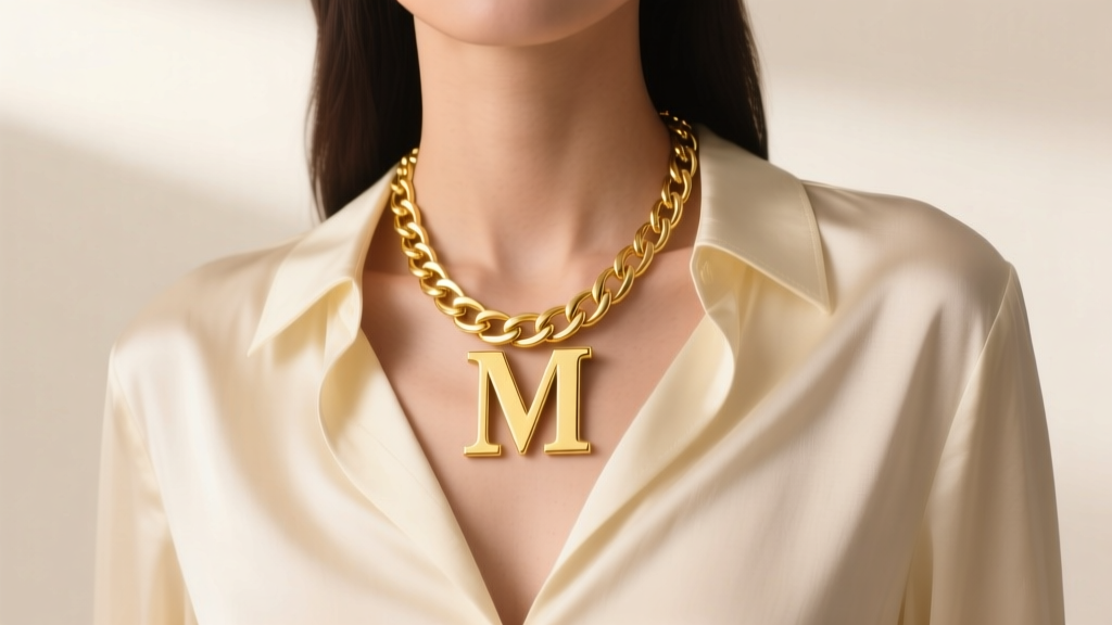
The jewelry landscape in 2026 has decisively shifted from whisper-thin minimalism to unapologetic maximalism. Nowhere is this more evident than in the resurgence of personalized typography. The big letter necklace has reclaimed its spot at the forefront of contemporary styling, evolving from a nostalgic Y2K staple into a sophisticated, architectural statement piece. Whether you are investing in solid 14k gold or exploring high-quality vermeil options, understanding the structural and stylistic nuances of oversized initial pendants is crucial for modern wardrobe integration.
The Evolution of the Initial Pendant: From Subtle to Statement
For over a decade, the market was dominated by the micro-initial trend—delicate 10mm to 15mm letters resting on gossamer 0.8mm chains. While dainty layering remains a viable technique, the 2026 aesthetic demands visual weight and singular focal points. According to trend forecasts highlighted by Vogue, consumers are increasingly gravitating toward "power personalization," where the initial itself acts as the primary outfit anchor rather than a subtle accessory.
This shift means that a true big letter necklace now features a face height ranging from 30mm to 55mm. The typography has also evolved; while classic serifs remain popular for vintage-inspired looks, bold, blocky sans-serif fonts and liquid-melt metallic designs are currently dominating high-fashion editorials and street style alike.
Anatomy of a Perfect Big Letter Necklace
When scaling up jewelry, structural integrity becomes just as important as visual appeal. A heavy pendant exerts significant tensile stress on its chain and findings. Here is what you must look for when evaluating the anatomy of an oversized initial piece.
Material Grades & Finishes
The surface area of a large letter pendant amplifies both the brilliance and the flaws of the metal used. For everyday wear, 14k solid gold (58.5% pure gold) remains the industry standard, offering an optimal balance of rich color and scratch resistance. If you are opting for gold vermeil, ensure the piece meets the US FTC standard: a 925 sterling silver base plated with a minimum of 2.5 microns of gold. Anything less will wear through to the silver base within months of friction against the collarbone. For budget-conscious buyers, surgical-grade stainless steel with PVD (Physical Vapor Deposition) gold coating offers exceptional tarnish resistance, as noted by metallurgical standards from the Gemological Institute of America (GIA).
Chain Gauge & Clasp Mechanics
A 40mm solid brass or gold letter pendant can easily weigh between 12 and 25 grams. Suspending this weight on a delicate 1.0mm chain is a recipe for snapped links and lost jewelry. You must match the chain gauge to the pendant's mass.
- 2.5mm to 3.5mm Curb or Figaro Chains: Ideal for medium-large letters (25mm-35mm). The interlocking flat links distribute weight evenly and resist pulling apart.
- 4.0mm+ Rope or Cuban Chains: Necessary for oversized, heavy-cast letters (40mm+). The twisted or tightly woven links provide superior tensile strength.
- The Jump Ring Rule: Always inspect the jump ring connecting the letter's bail to the chain. It must be soldered shut. An unsoldered 4mm jump ring will inevitably warp and open under the pendulum motion of a heavy letter.
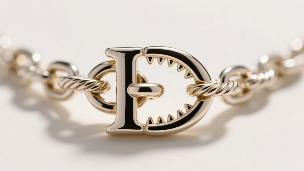
Furthermore, discard any big letter necklace that relies on a tiny 5mm spring ring clasp. The counterweight of a heavy pendant will constantly pull the chain backward, causing a weak spring ring to snag in your hair or pop open. A 12mm to 15mm lobster claw clasp, or a weighted toggle clasp, is non-negotiable for secure wear.
2026 Trend Forecast: What’s In and What’s Out
To ensure your styling remains current, we have mapped out the definitive dos and don'ts of the oversized initial trend for this year.
| Element | 2026 Status | Styling Notes |
|---|---|---|
| Block Sans-Serif Fonts | IN | Gives a brutalist, modern edge; pairs well with tailored suiting and streetwear. |
| Filigree & Lace-like Serifs | OUT | Reads as dated and overly ornate; lacks the structural boldness of current trends. |
| Mixed Metal Inlays | IN | Yellow gold letters with white diamond or mother-of-pearl inlays add necessary texture. |
| Rhinestone Encrusting | OUT | Full-pave initial pendants feel reminiscent of early 2010s fast fashion; opt for a single accent stone instead. |
| Choker-Length Drops (14-15") | IN | Keeps the heavy pendant anchored at the clavicle, preventing it from swinging and tangling. |
Proportion & Placement: Matching Necklines to Letter Sizes
The sheer scale of a big letter necklace dictates how it interacts with your wardrobe. A 45mm initial will clash with complex patterns or high, ruffled collars. Here is a practical framework for matching your pendant size to your neckline:
- Deep V-Necks & Plunging Lines: Opt for an 18-inch to 20-inch chain. The letter should rest precisely at the apex of the V-neck, drawing the eye downward and elongating the torso. A 35mm to 45mm letter works best here.
- Crew Necks & Turtlenecks: Choose a 16-inch choker length. The letter should sit prominently above the fabric line. Stick to slightly smaller "big" letters (25mm to 30mm) so the piece doesn't look like it is drowning in the fabric.
- Off-the-Shoulder & Asymmetric: Use an asymmetric or lariat-style big letter necklace. The vertical drop of the letter complements the horizontal expanse of exposed skin, creating a striking geometric contrast.
Layering Frameworks for Statement Initials
While the 2026 trend heavily favors the "hero piece" approach, layering a big letter necklace is still possible if you adhere to strict spatial rules. The primary challenge with layering a massive initial pendant is tangling; the large surface area of the letter acts as a net, catching adjacent chains.
"When layering a statement initial, treat it as the anchor. Build upward with texture, not downward with more pendants. The eye needs a place to rest." — Editorial Direction, Harper's Bazaar Jewelry Guide
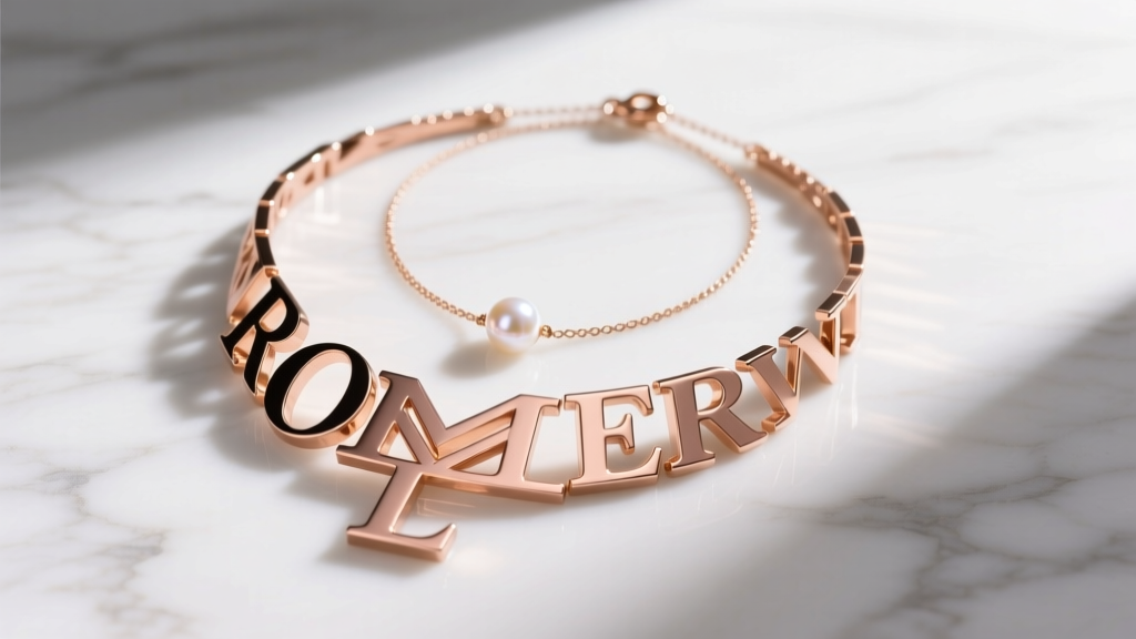
To achieve a tangle-free layered look, utilize the 2-Inch Gap Rule. If your big letter necklace sits at 16 inches, your secondary chain must be no longer than 14 inches (a tight choker) or start at 18 inches. Never place a secondary chain directly above or below the letter's bail. For the 18-inch companion chain, opt for a textured metal (like a 2mm crinkle chain) or a strand of 4mm freshwater pearls. This provides visual contrast without competing with the typographic weight of the initial.
Investment vs. Fast Fashion: Pricing Tiers
Because of the increased metal weight required for oversized pendants, the price gap between fine jewelry and fashion jewelry is more pronounced than with dainty pieces. Use this pricing matrix to set realistic expectations and ensure you are paying a fair market rate based on material intrinsic value.
| Tier | Material Composition | Estimated Price Range (35mm Letter) | Longevity & Care |
|---|---|---|---|
| Fine / Investment | Solid 14k or 18k Gold (Yellow, White, or Rose) | $450 – $950+ | Lifetime wear. Can be polished, repaired, and passed down. Requires minimal care. |
| Demi-Fine / Bridge | Heavy Gold Vermeil (3+ microns over 925 Silver) | $120 – $220 | 2 to 5 years of regular wear. Must be kept dry and stored in anti-tarnish pouches. |
| Fashion / Trend | Brass or Zinc Alloy with Flash Plating or PVD | $35 – $85 | 6 to 18 months. Prone to brass bleed-through and skin oxidation if the coating fails. |
Final Verdict: Owning the Typographic Trend
The big letter necklace is no longer just a sentimental trinket; it is a masterclass in wearable graphic design. By prioritizing structural integrity—such as soldered jump rings, appropriate chain gauges, and high-quality metallic finishes—you ensure that your statement piece withstands both the physical demands of its weight and the cyclical nature of fashion. Whether you choose a brutalist block 'A' in solid yellow gold or a liquid-melt 'S' in polished silver, the key to mastering this 2026 trend lies in confident, uncluttered styling. Let the letter speak for itself.


