Chunky Initial Necklace Trends: 2026 Style & Sizing Guide
Discover 2026 chunky initial necklace trends, from heavy gauge metals to typography styles. Learn how to layer and size these statement pendants.

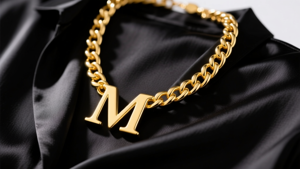
The jewelry landscape has decisively pivoted. The whisper-thin, barely-there initial pendants that dominated the 2010s have been entirely eclipsed by the unapologetic weight and presence of the chunky initial necklace. In 2026, this isn't just a nostalgic nod to Y2K mall-kiosk jewelry; it is a refined exercise in personal branding, maximalist proportion, and metallurgical substance. Today's statement initials are architectural, heavy, and designed to anchor an entire outfit. Whether you are investing in solid gold or exploring high-quality vermeil, understanding the mechanics, typography, and styling frameworks of these heavy pendants is essential for making a lasting sartorial impact.
The Anatomy of a True Chunky Initial Necklace
To classify as genuinely "chunky" in the current market, an initial pendant must transcend mere surface area. Many mass-market brands sell wide but paper-thin letters that dent easily and lack visual gravity. A true chunky initial necklace is defined by its three-dimensional volume and structural integrity.
- Depth and Thickness: While standard dainty initials range from 0.8mm to 1.2mm thick, a premium chunky pendant boasts a depth of 3.5mm to 7mm. This allows for intricate edge-beveling and diamond-cut facets that catch the light.
- Weight: Expect a substantial feel. Authentic chunky letters typically weigh between 15 grams and 45 grams, depending on the letter's physical footprint (e.g., an 'I' versus a 'W').
- The Bail (Crucial Failure Point): The bail is the loop connecting the pendant to the chain. A 30-gram pendant swinging on a thick chain creates immense friction. If the bail is hollow or under 2.5mm thick, the chain will act as a file, severing the gold within months. Always seek a solid, soldered jump-ring bail or an integrated loop cast directly into the letter's top serif.
2026 Typography & Font Trends
The era of the generic, sans-serif block letter is fading. As noted in recent accessory reports by Vogue, consumers are demanding typographic nuance. The font of your initial now acts as a micro-signifier of your personal aesthetic.
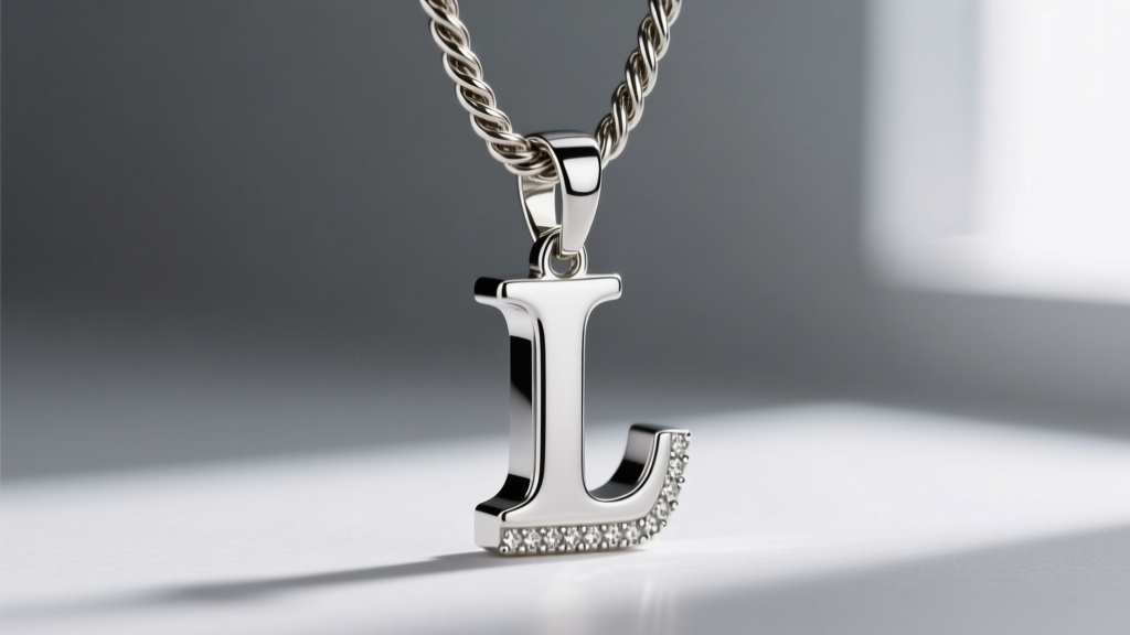
Editorial Serifs
Inspired by high-fashion magazine mastheads, sharp serif initials (reminiscent of Didot or Bodoni) are the top trend for 2026. The extreme contrast between the thick and thin strokes of the letterform translates beautifully into 3D metal, creating dramatic shadows against the collarbone.
Neo-Gothic & Blackletter
Streetwear and high-gothic aesthetics have merged to popularize ornate Blackletter initials. These chunky pendants often feature sharp, jagged serifs and are frequently cast in oxidized silver or darkened 14k gold to emphasize the intricate, labyrinthine grooves of the font.
Soft Bubble & Liquid Chrome
On the opposite end of the spectrum, the Y2K revival has birthed the "liquid" initial. These chunky letters lack hard edges entirely, resembling molten metal or inflated balloons. They are highly reflective and offer a playful, approachable take on heavy jewelry.
Material Grades & Durability Matrix
Because chunky initials require significantly more raw material than delicate charms, the choice of metal dictates both the price and the longevity of the piece. According to metal grading standards outlined by the Gemological Institute of America (GIA), understanding the alloy composition is vital for heavy-wear items that experience frequent friction against the skin and clothing.
| Material | Average Weight (Size M) | 2026 Price Range | Durability & Maintenance |
|---|---|---|---|
| 14k Solid Gold | 16g - 22g | $1,200 - $1,700 | Excellent. High scratch resistance due to copper/silver alloys. Will not tarnish. Ideal for daily, lifelong wear. |
| 18k Solid Gold | 18g - 25g | $1,600 - $2,400 | Good. Richer, deeper yellow hue but softer than 14k. More prone to micro-scratches and edge-denting if dropped on tile. |
| Heavy Gold Vermeil | 15g - 20g | $130 - $280 | Moderate. Must be 2.5 microns of 14k+ gold over solid brass or silver. The friction from heavy chains will eventually wear the gold off the bail area. |
| 316L Stainless Steel | 20g - 35g | $45 - $95 | Indestructible. Highly scratch-resistant and waterproof. Heavier on the neck, but lacks the warm luster and intrinsic value of precious metals. |
Sizing & Proportion Framework
A chunky initial necklace can easily overwhelm the wearer if the scale is miscalculated. The goal is bold presence, not cartoonish disproportion. Use this framework to select the correct pendant height based on your anatomy and neckline preferences.
The Collarbone Rule: For a standard 16-inch to 18-inch chain, the pendant's height should not exceed 25mm if you have a petite frame or a shorter neck. If you have a longer torso or prefer a 20-inch to 22-inch chain that rests on the upper chest, you can comfortably scale up to 35mm or 40mm letters.
Furthermore, consider the visual weight of the specific letter. An "O" or "Q" has a massive surface area and will look significantly larger and heavier than an "I" or "T" of the exact same millimeter height. When ordering custom chunky initials, many jewelers scale the width of the wider letters down slightly to maintain a uniform visual weight across different initials.
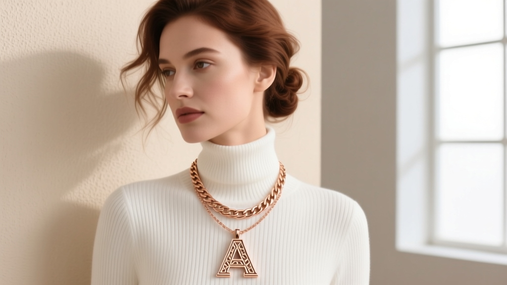
Advanced Layering: The 2-Inch Drop Rule
Layering a heavy, chunky initial pendant requires strategic spacing. The most common mistake is pairing a heavy pendant with a delicate secondary chain of a similar length, resulting in constant tangling and severe scratching of the softer metals.
To master the 2026 maximalist layering look, adhere to the 2-Inch Drop Rule. If your chunky initial hangs on an 18-inch chain (typically a 4mm to 6mm Cuban or Figaro link to support the weight), your secondary necklace must sit at exactly 16 inches (a snug choker or collar) or 20 inches (a mid-chest resting point). This creates a mandatory 2-inch buffer zone that prevents the heavy, swinging initial from colliding with your other jewelry. For the secondary chain, opt for textured ropes or bead chains, which provide visual contrast to the smooth, polished surfaces of the chunky initial pendant.
Final Thoughts on Investment Styling
The chunky initial necklace has matured from a fleeting pop-culture accessory into a cornerstone of modern jewelry wardrobes. By prioritizing structural depth, demanding solid bails, and selecting typography that resonates with your personal brand, you secure a piece that transcends seasonal micro-trends. Whether you opt for the editorial sharpness of a gold serif or the molten edge of a liquid-chrome bubble letter, the key to pulling off this trend is embracing the weight—both literal and visual—of your chosen statement.


