How to Choose the Perfect Necklace with K Initial: A Buyer's Guide
Discover how to choose the perfect necklace with K initial. Our expert buyer's guide covers metal grades, chain styles, typography, and sizing tips.

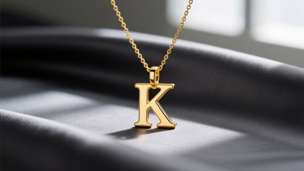
Personalized jewelry has transcended fleeting trends to become a permanent staple in modern wardrobes. As we navigate the jewelry market in 2026, the shift towards sustainable, lab-grown diamond accents and recycled precious metals has made high-quality, bespoke initial pieces more accessible than ever. Among the alphabet, the letter K stands out for its striking, angular geometry. Whether you are shopping for yourself, honoring a loved one named Katherine, or celebrating a meaningful milestone, selecting the right necklace with K initial requires a keen eye for typography, metal durability, and chain mechanics. This comprehensive buyer's guide will walk you through the exact specifications, material grades, and design nuances you need to make an informed, lasting investment.
The Unique Geometry of the Letter K
Unlike symmetrical letters such as O, A, or M, the letter K features a distinct vertical stem intersected by two diagonal arms. This creates dynamic negative space and sharp outer points. From a jewelry manufacturing perspective, these sharp points—the top and bottom tips of the diagonal arms—are potential snag hazards if not properly filed and polished. When evaluating a K pendant, run your finger along the edges. High-quality castings will feature slightly softened, buttery edges rather than razor-sharp corners, ensuring the pendant rests comfortably against the collarbone without catching on delicate knitwear or silk blouses.
Decoding Typography: Choosing the Right Font
The typography of your initial dictates the entire mood of the necklace. Because the K is inherently structural, the font choice will either amplify its modern edge or soften it into a vintage heirloom.
Serif, Sans-Serif, and Script
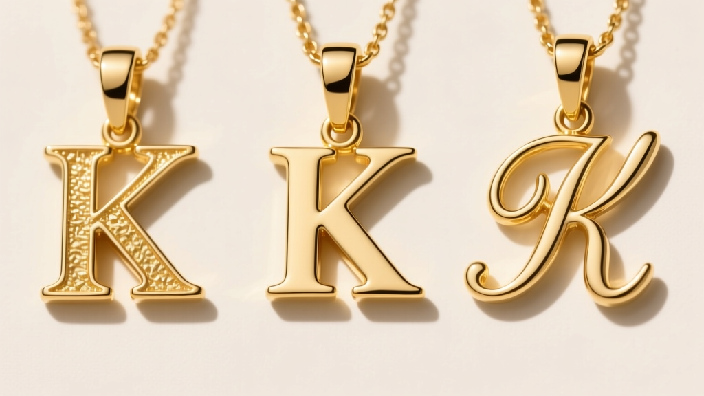
- Sans-Serif (Minimalist): Characterized by clean, uniform lines without decorative 'feet'. A sans-serif K is the ultimate choice for everyday layering. It reads as modern, architectural, and effortlessly chic. Look for a stem width of about 1.5mm to 2mm for optimal visibility without bulk.
- Serif (Classic): Features small projecting lines at the ends of the strokes. A serif K evokes an academic, vintage, or editorial aesthetic. The serifs add weight to the top and bottom of the vertical stem, making the pendant feel more substantial and traditional.
- Script (Romantic): Cursive Ks can be incredibly elegant but require careful design execution. Because the diagonal arms of the K naturally extend outward, a heavily looped script can make the letter look cluttered or unrecognizable from a distance. If choosing a script K, ensure the loops are open and the negative space is preserved.
Metal Grades and Material Longevity
The metal you choose dictates not only the color and price but also the structural integrity of the pendant's sharp points. According to the Gemological Institute of America (GIA), understanding gold alloys is critical for everyday wear jewelry.
| Metal Type | Purity / Grade | Durability & Wear | Price Range (Approx.) | Best For |
|---|---|---|---|---|
| 14k Yellow/White Gold | 58.5% Pure Gold | Highly durable; resists bending and edge wear. | $150 - $350 | Everyday wear, active lifestyles. |
| 18k Yellow/White Gold | 75% Pure Gold | Softer; richer color but prone to micro-scratches. | $300 - $600 | Heirloom pieces, occasional wear. |
| Sterling Silver (925) | 92.5% Silver, 7.5% Copper | Prone to tarnish; requires rhodium plating. | $45 - $120 | Budget-friendly, trend-driven styling. |
| Platinum (950) | 95% Pure Platinum | Extremely dense; develops a patina rather than wearing away. | $600 - $1,200+ | Hypoallergenic needs, diamond pavé settings. |
For a necklace with K initial that will be worn daily, 14k gold is the undisputed champion. The alloy metals (like zinc and copper) provide the tensile strength needed to protect the delicate diagonal arms of the K from snapping or warping if the chain is accidentally tugged.
Chain Selection: The Backbone of Your Initial Pendant
A common mistake buyers make is pairing a beautifully crafted initial pendant with an incompatible chain. The chain must support the pendant's weight without overpowering its visual footprint.
Best Chains for 'K' Pendants
The angular nature of the letter K means it can easily tangle in certain chain weaves. We recommend the following specifications:
- Box Chain (0.9mm - 1.2mm): The square, interlocking links lay perfectly flat against the skin and are virtually tangle-free. A 1mm 14k gold box chain provides a sleek, modern backdrop that complements the geometric lines of a sans-serif K.
- Cable Chain (1.0mm - 1.5mm): The classic oval links offer a traditional look. Ensure the links are soldered (closed with a tiny weld) rather than simply bent shut, which prevents the chain from pulling apart under the weight of a solid gold pendant.
- Chains to Avoid: Snake chains and herringbone chains. While beautiful, their tightly wound, tubular structures are notorious for kinking and trapping hair, which can be frustrating when trying to unclasp a delicate initial necklace.
Sizing, Proportions, and Bail Types
The scale of your K pendant should align with your styling intentions. For a subtle, layered look (stacking with a 16-inch choker and a 20-inch coin necklace), opt for a micro K pendant measuring between 8mm and 10mm in height. If the necklace is meant to be a standalone statement piece resting on the collarbone, a height of 15mm to 20mm is ideal.
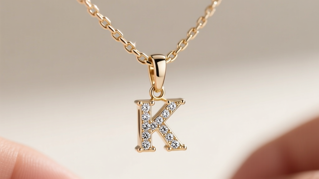
Pay close attention to the bail—the loop that connects the pendant to the chain. The best initial necklaces feature a hidden bail or a soldered jump ring integrated seamlessly into the top of the vertical stem. A hidden bail creates the illusion that the letter K is floating directly on the chain, offering a much cleaner, more luxurious profile than a bulky, visible loop.
Diamond Accents and Gemstone Inlays
If you are elevating your K initial with gemstones, precision in setting is paramount. The most popular and structurally sound placement for diamonds is a pavé setting along the vertical stem. This highlights the backbone of the letter without compromising the sharp, clean lines of the diagonal arms. When purchasing a diamond-accented K, look for VS clarity and G-H color grades; because the diamonds are typically micro-pavé (1mm to 1.5mm), higher grades offer diminishing visual returns but exponentially increase the price.
Alternatively, consider a bezel-set birthstone nestled in the lower negative space of the K. A 3mm round sapphire or emerald set in a smooth metal bezel adds a personalized splash of color while maintaining a smooth surface that won't snag on clothing.
Expert Tips for Authenticating and Purchasing
When investing in fine jewelry, authentication and proper care are non-negotiable. Always verify that the clasp and pendant bear the appropriate hallmarks. For instance, a genuine 14k gold piece will be stamped with '14k', '14KT', or '585'. The Jewelers of America strongly recommends purchasing from retailers who provide clear metallurgical disclosures and offer post-purchase polishing services.
Furthermore, inspect the clasp. A 5mm or 6mm lobster claw clasp is vastly superior to a standard spring-ring clasp. Lobster clasps feature a solid internal spring mechanism that is far less likely to fail or accidentally open, ensuring your personalized K initial remains safely around your neck.
Final Verdict
Finding the perfect necklace with K initial is about balancing striking geometry with everyday wearability. By prioritizing a 14k gold construction, selecting a tangle-resistant box or cable chain between 0.9mm and 1.2mm, and opting for a clean sans-serif or carefully proportioned serif typography, you secure a piece that is both deeply personal and structurally enduring. Whether worn alone as a testament to your identity or layered into a curated 2026 necklace stack, a well-crafted K pendant is an investment in timeless, personalized style.


