Mastering the Drawing of Pearl Necklace Designs: 2026 Trends
Explore the art of the drawing of pearl necklace designs. Discover 2026 sketching trends, rendering techniques for luster, and illustration tips.


The Intersection of Art and Gemology in Jewelry Illustration
The drawing of pearl necklace concepts is a foundational skill that bridges the gap between abstract inspiration and tangible luxury. Unlike faceted gemstones, which rely on sharp geometric lines and high-contrast black-and-white zoning to simulate brilliance, pearls are organic, spherical, and deeply nuanced. Translating the soft, satiny luster of nacre onto a two-dimensional plane requires an intimate understanding of optics, gravity, and material science. As we move through 2026, the landscape of jewelry design has shifted dramatically, blending traditional hand-rendered gouache techniques with advanced digital CAD workflows. Whether you are a seasoned bench jeweler, a fashion illustrator, or an aspiring design student, mastering the sketching of pearl jewelry is essential for communicating your vision to clients and manufacturers.
Historically, the Victoria and Albert Museum notes that jewelry sketches served as the primary blueprint for master goldsmiths, utilizing watercolor and ink to denote material weight and drape. Today, while 3D rendering software dominates the manufacturing pipeline, the initial drawing of pearl necklace silhouettes remains a vital step in capturing the organic flow and emotional resonance of a piece. In this comprehensive guide, we will dissect the anatomy of pearl rendering, explore the dominant design trends of 2026, and provide a step-by-step framework for illustrating these luminous gems.
The Optics of Nacre: Rendering Luster and Overtone
To accurately draw a pearl, one must first understand how light interacts with its surface. According to the Gemological Institute of America (GIA), a pearl's beauty is defined by its luster (the sharpness of light reflections) and its orient (the iridescent play of colors just below the surface). When sketching, you are not drawing a solid white sphere; you are drawing a complex map of reflected light.
The Four Zones of Pearl Shading
- The Highlight (Specular Reflection): This is the brightest point, usually positioned at a 45-degree angle from your designated light source. For high-luster Akoya pearls, this highlight is crisp and sharply defined. For South Sea pearls, it is softer and more diffused.
- The Mid-Tone (Bodycolor): The true color of the pearl (white, cream, silver, or gold) is most visible in the mid-tone zone, bridging the gap between the light and the shadow.
- The Core Shadow: The darkest part of the sphere, located opposite the light source. This grounds the pearl and gives it three-dimensional volume.
- The Reflected Light: A subtle bounce of light from the environment (or the wearer's skin) that illuminates the bottom edge of the core shadow. Omitting this is the most common mistake made by novice illustrators, resulting in pearls that look like flat, matte beads.
Akoya vs. Baroque: Adjusting Your Stroke for 2026 Silhouettes
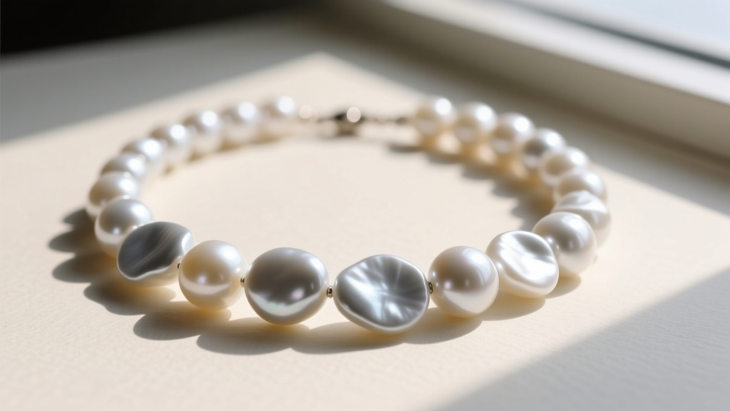
The 2026 runway season has seen a massive departure from perfectly matched, traditional pearl strands. Designers are heavily favoring asymmetry, mixed media, and organic shapes. When executing the drawing of pearl necklace designs featuring varying pearl types, your illustration technique must adapt to the specific gemology of the stone.
Illustrating Akoya and Hanadama Pearls
Akoya pearls are renowned for their mirror-like luster. When sketching these, use hard-edged white gouache or a digital hard-round brush with 100% opacity for the highlights. The contrast between the highlight and the mid-tone should be abrupt. In 2026, tension-set Akoya chokers—where the pearls appear to float between invisible wires or sleek platinum bars—are trending heavily. Illustrating these requires precise, ruler-straight lines for the metalwork to contrast with the perfect spherical geometry of the pearls.
Illustrating Baroque and Keshi Pearls
Baroque pearls are non-symmetrical, featuring undulating surfaces, ridges, and valleys. Drawing these requires abandoning the perfect sphere template. Instead, map out the irregular topography first. The highlights on a baroque pearl will be scattered, elongated, and fragmented across the ridges of the nacre. Use a kneaded eraser to pull out soft, irregular highlights in graphite, or use a low-opacity digital airbrush to build up the complex, multi-faceted reflections. Keshi pearls, being solid nacre without a bead nucleus, often exhibit extreme orient; illustrate this by layering subtle washes of pink, green, or silver over the mid-tones.
2026 Trend Analysis: What Sketches Reveal About Runway Pearls
By analyzing the initial sketches and technical drawings of top jewelry houses, we can decode the prevailing aesthetics of the year. The table below breaks down the dominant 2026 pearl necklace trends and the specific illustration techniques required to convey them effectively to a client or production team.
| 2026 Design Trend | Aesthetic Description | Required Sketching Technique |
|---|---|---|
| Liquid Metal Draping | Pearls integrated into molten-looking, asymmetric silver or gold flows. | High-contrast metallic shading (deep blacks to stark whites) to make the soft pearl luster pop by comparison. |
| Raw Diamond Clusters | Uncut, rough diamonds interspersed with smooth baroque pearls. | Use jagged, chaotic hatching for the rough diamonds to create a tactile contrast against the smooth, blended gradients of the pearls. |
| Oxidized Silver Pairings | Dark, blackened silver chains holding bright white South Sea pearls. | Heavy graphite saturation for the chain links; utilize the dark background to amplify the pearl's reflected light. |
| Convertible Y-Necklaces | Modular designs where the pearl drop can be detached or adjusted. | Exploded-view technical drawings alongside the stylized fashion sketch to clarify the mechanical clasps and jump rings. |
Step-by-Step Framework: The Drawing of Pearl Necklace Asymmetry
Creating a compelling, realistic illustration of an asymmetric pearl necklace requires a structured approach. Follow this four-step framework to ensure anatomical accuracy and optical realism.
- Map the Catenary Drape: Never draw a necklace as a perfect semi-circle. A necklace resting on the collarbone follows a catenary curve—the natural shape a chain takes when suspended between two points. Sketch the underlying wire or silk thread first, accounting for the weight of the pearls. Heavier South Sea pearls will pull the curve lower and tighter against the neck.
- Block in the Spheres: Lightly draw the outer boundaries of each pearl along the catenary line. If designing a graduated strand, meticulously measure the millimeter increments (e.g., transitioning from 6mm at the clasp to 9mm at the center drop).
- Establish the Global Light Source: Decide where the light is coming from (e.g., top-left). Apply the core shadows to all pearls simultaneously to maintain environmental consistency. A common error is shading each pearl individually, which makes the necklace look disjointed.
- Apply Luster and Hardware: Add the specular highlights last. Draw the clasps, jump rings, and any accent gemstones. Ensure the metal findings reflect the same light source as the pearls.
"The secret to drawing pearls is not in the white paint; it is in the depth of the shadows surrounding them. Luster is merely the contrast between the darkest dark and the lightest light." — Master Jewelry Rendering Principles
Tools of the Trade: Analog vs. Digital Workflows
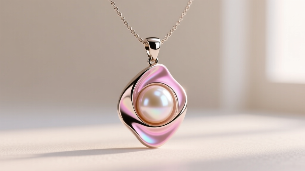
The tools you select will heavily influence the mood and technical accuracy of your drawing of pearl necklace concepts. In 2026, most professionals utilize a hybrid approach, starting with analog thumbnails before moving to digital rendering.
Traditional Media Essentials
For traditional rendering, toned grey or mid-tone vellum paper is vastly superior to bright white paper. Starting on a mid-tone allows you to use a white gel pen (like the Sakura Gelly Roll 08) or white gouache strictly for the highlights, instantly creating the illusion of luster. Use a 2B or 4B graphite pencil for the core shadows, and a Tombow Mono Zero eraser to lift out subtle reflected light on the bottom edges of the pearls. For colored overtones, high-quality colored pencils (such as Prismacolor Verithin) allow for delicate, translucent layering that mimics the optical phenomenon of orient.
Digital and CAD Advancements
For digital illustrators, Procreate and Adobe Fresco offer specialized blending brushes that mimic the soft sfumato effect required for South Sea pearls. Utilizing the 'Add' or 'Overlay' blend modes for the highlights can simulate the translucent depth of nacre. Furthermore, initial 2D sketches are increasingly being imported into 3D CAD software like Rhino or MatrixGold. In these programs, designers apply physically based rendering (PBR) materials to their 3D pearl models, allowing them to adjust the 'roughness' and 'clearcoat' sliders to perfectly match the luster grade specified in their original 2D sketches.
Conclusion: The Enduring Power of the Sketch
While technology continues to revolutionize how jewelry is manufactured, the initial drawing of pearl necklace designs remains an irreplaceable art form. It is in the sketch that the designer first negotiates the tension between the organic imperfections of the pearl and the rigid geometry of the metalwork. By mastering the optical physics of nacre, understanding the structural drape of the catenary curve, and staying attuned to the asymmetric, mixed-media trends of 2026, illustrators and designers can create compelling visual blueprints that captivate clients and guide master jewelers toward flawless execution.


