The Letter G Necklace: 2026 Trend & Styling Analysis
Discover 2026 letter G necklace trends. Explore typography shifts, mixed-metal layering, and expert styling tips for initial pendants.

The Shift from Generic to Bespoke: The 2026 'G' Phenomenon
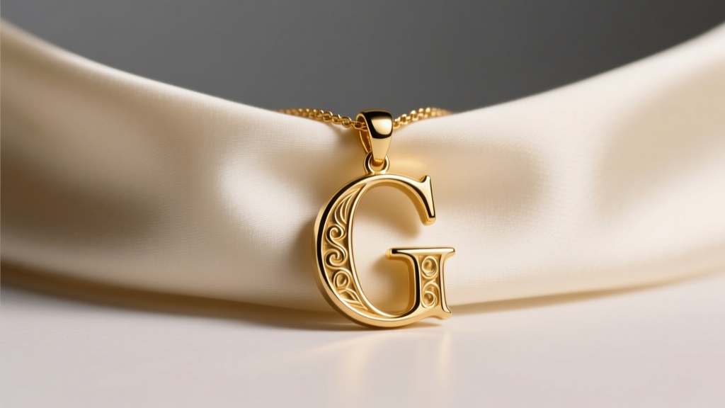
Initial jewelry has long been a staple in personal adornment, but as we navigate the 2026 jewelry landscape, the letter G necklace has emerged as a distinct focal point for stylists and collectors alike. Moving away from the generic, block-letter charms of the early 2010s, today's market demands bespoke typography, mixed-metal integration, and highly specific chain pairings. The letter 'G'—often associated with grace, generation, and groundedness—offers a unique geometric silhouette that balances sharp angles with sweeping curves, making it an ideal canvas for advanced metallurgical and typographic experimentation.
According to recent luxury market analyses, personalized jewelry continues to capture a significant share of the fine jewelry market, driven by a consumer desire for narrative-driven pieces. However, the modern letter G necklace is no longer just about the initial; it is about the execution of the initial. From the exact micron thickness of gold vermeil to the specific serif font chosen, every detail dictates the pendant's aesthetic weight and longevity.
Typography Analysis: Which 'G' Fits Your Aesthetic?
The silhouette of your initial pendant fundamentally alters its visual impact. In 2026, jewelry designers are categorizing letter G pendants into three primary typographic families, each serving a distinct styling purpose.
1. The High-Contrast Serif (e.g., Didot, Bodoni)
Serif 'G' pendants feature thick and thin line variations with sharp, elegant terminal serifs. A 10mm to 12mm serif G cut from 14k solid gold offers a sophisticated, editorial look. The sharp edges catch the light dynamically, making it the preferred choice for minimalist layering or wearing solo against a silk blouse. The thin hairlines of the serif require a minimum metal thickness of 1.2mm to prevent structural warping over time.
2. The Geometric Sans-Serif (e.g., Futura, Helvetica)
For a modern, architectural aesthetic, the sans-serif 'G' relies on uniform line weight and perfect circular geometry. Typically cast in 1.5mm to 2.0mm widths, these pendants are highly durable and resistant to snagging. They are frequently crafted in brushed or matte-finish platinum and 18k white gold, appealing to those who favor a utilitarian, gender-neutral aesthetic.
3. The Fluid Script and Signet Hybrids
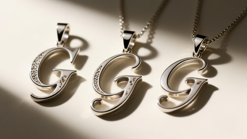
Script 'G' pendants have evolved from delicate, easily tangled cursive wires into bold, signet-inspired hybrids. Designers are now merging the sweeping lower loop of a script 'G' with the solid, flat face of a signet ring, often incorporating oxidized sterling silver to highlight the engraved grooves. This style demands a heavier chain—such as a 2.5mm curb chain—to support the pendant's increased gram weight.
Material Grades and Pricing Matrix
When investing in a letter G necklace, understanding material grades is critical to avoiding premature tarnishing or structural failure. The Federal Trade Commission (FTC) Jewelry Guides strictly regulate terms like 'vermeil' and 'solid gold,' yet consumer confusion remains high. Below is a breakdown of the most common materials used for initial pendants in 2026.
| Material Grade | Composition & Thickness | Avg. Price Range (USD) | Durability & Maintenance |
|---|---|---|---|
| 14k Solid Gold | 58.5% pure gold, alloyed with copper/silver | $250 - $600 | Highly durable, waterproof, requires minimal polishing. |
| 18k Gold Vermeil | Sterling silver base with ≥2.5 microns of 18k gold | $85 - $180 | Moderate. Must be kept dry. Re-plating needed every 2-3 years. |
| Oxidized Sterling Silver | 92.5% pure silver, chemically darkened in grooves | $60 - $150 | Prone to scratching. Clean only with a soft cloth, no liquid dips. |
| 316L Surgical Steel | Iron-carbon alloy with chromium and molybdenum | $30 - $75 | Extremely durable, hypoallergenic, but lacks the luster of precious metals. |
For heirloom-quality letter G pendants, the Gemological Institute of America (GIA) recommends 14k or 18k solid gold, as the alloy mix provides the necessary tensile strength to support delicate serif edges without bending during daily wear.
The Architecture of Layering: Chain Gauges and Lengths
A letter G necklace rarely exists in isolation. The 2026 layering framework relies on precise mathematical increments in chain length and contrasting chain weaves to prevent tangling and ensure each piece is visible.
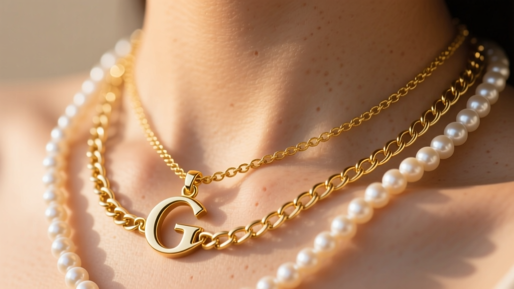
- The Anchor (14" - 15"): Start with a 1.0mm box chain or a delicate 2mm freshwater pearl choker. This sits high on the collarbone and frames the face.
- The Focal Point (16" - 17"): This is where your letter G pendant resides. Opt for a 1.2mm to 1.5mm cable chain. The cable weave is flexible enough to allow the 'G' to lay flat against the sternum, unlike stiffer rope chains which can cause the pendant to flip backward.
- The Ballast (18" - 20"): Finish with a heavier, un-pendanted chain, such as a 3.0mm paperclip or Figaro chain. The visual weight of the bottom chain grounds the stack and prevents the delicate initial pendant from looking isolated.
Clasp Engineering: Pay close attention to the clasp. A 1.2mm spring ring is standard for delicate chains but notoriously difficult to fasten. Upgrading to a 5mm lobster clasp or a custom-engraved toggle clasp not only improves functionality but adds a subtle, high-end bespoke detail to the back of the neck.
Neckline Compatibility Framework
The geometry of the letter G interacts differently with various garment necklines. Use this framework to optimize your styling:
- The Crew Neck: Pair with a 14" choker and a 16" bold, 20mm script 'G' pendant worn over the fabric. Avoid delicate chains, as they will disappear into the cotton folds.
- The Deep V-Neck: Utilize a 18" or 20" chain with a 12mm serif 'G'. The pendant should rest exactly one inch above the apex of the V-neck, drawing the eye vertically and elongating the torso.
- The Square Neck: The sharp angles of a square neckline perfectly complement a geometric sans-serif 'G'. Keep the chain short (15") so the pendant sits in the negative space between the collarbones, avoiding visual competition with the garment's hem.
- The Off-the-Shoulder: This exposes the entire clavicle area. Opt for an asymmetrical stack: a 14" pearl strand and an 18" delicate chain with a tiny 8mm 'G' charm resting off-center.
Final Verdict: Investing in the Right 'G'
The letter G necklace in 2026 is a masterclass in micro-styling. It requires a departure from impulse-buying generic charms and a move toward intentional curation of typography, metal grade, and chain architecture. Whether you choose the sharp editorial edge of a Didot-inspired serif in 14k gold or the grounded, utilitarian feel of a brushed steel sans-serif, the key lies in the precision of the proportions.
"An initial pendant is not just a letter; it is a piece of wearable typography. The curve of the 'G' dictates how light hits the metal, and the chain gauge dictates how it moves with the body. Treat it with the same rigor you would a fine timepiece." — Elara Vance, Senior Jewelry Archivist
By understanding the structural nuances of your chosen piece and adhering to proper material care, your letter G necklace will transcend fleeting trends, anchoring your personal style for decades to come.


