How to Style an Old English Initial Necklace for Beginners
Discover how to choose, style, and layer an Old English initial necklace. Our beginner guide covers metals, chain types, and font proportions.

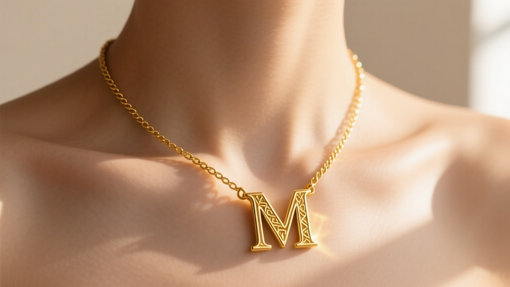
Personalization in jewelry has evolved far beyond basic block-letter charms and simple script fonts. For those seeking a piece with historical weight, moody aesthetics, and intricate detailing, the old english initial necklace has become a definitive staple in modern wardrobes. Rooted in Blackletter typography, this style bridges the gap between vintage heritage and contemporary streetwear, making it a versatile choice for beginners looking to elevate their everyday accessories.
However, buying and styling an Old English pendant requires more than just picking your first initial. The sharp serifs, deep grooves, and varied letter proportions introduce unique challenges regarding metal wear, chain pairing, and pendant physics. In this beginner-friendly explainer, we will break down exactly how to choose, style, and care for your Blackletter jewelry like a seasoned industry expert.
The Anatomy of Blackletter Jewelry
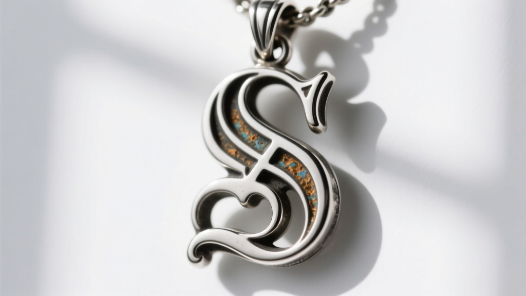
Before diving into metals and chains, it is essential to understand what makes this font style unique in jewelry design. Old English, historically known as Blackletter or Gothic script, originated in the 12th century for illuminated manuscripts. In jewelry, this translates to thick vertical strokes, sharp diamond-shaped accents, and highly ornate serifs.
According to typography experts at Typewolf, Blackletter is defined by its high contrast and dense, woven appearance. When cast in metal, these dense lines create deep "valleys" and sharp "peaks." This structural complexity is beautiful, but it fundamentally changes how the metal interacts with your skin, oils, and the elements. Understanding this anatomy is the first step to making a smart purchase.
Choosing Your Metal: The "Groove" Factor
Because Old English letters feature deep, narrow grooves, the metal you choose dictates the longevity and maintenance level of your necklace. Here is how the three most common metals perform in this specific design:
Sterling Silver (.925)
Sterling silver is the most popular entry-level choice, typically priced between $40 and $90. However, silver naturally oxidizes when exposed to moisture and sulfur. In a smooth, polished pendant, this tarnish is easy to wipe away. In an Old English pendant, the deep grooves trap lotions, perfumes, and dead skin cells, accelerating tarnish in the hard-to-reach valleys. If you choose silver, expect to spend extra time cleaning the crevices.
Gold Vermeil (2.5 Microns over .925)
Vermeil offers the look of gold at a mid-tier price point ($80 to $150). For an Old English initial necklace, you must ensure the gold plating is at least 2.5 microns thick. The sharp points of the Blackletter serifs are high-friction areas that rub against your clothing and skin. Thin plating (under 1.0 microns) will wear off the sharp edges within months, leaving you with a two-toned pendant that exposes the silver base metal.
Solid 14k or 18k Gold
Priced from $250 to over $600, solid gold is the ultimate choice for everyday wear. It will not tarnish in the deep grooves, meaning the intricate details of the Blackletter font will remain crisp and bright for a lifetime. As noted by the Gemological Institute of America (GIA), solid gold alloys provide the necessary durability for intricate, high-relief jewelry designs that are worn daily.
Chain Pairings: Matching the Visual Weight
An Old English initial is visually heavy, ornate, and commanding. Pairing it with the wrong chain can either overpower the pendant or make it look disproportionately top-heavy. The goal is to choose a chain that provides structural support without competing with the intricate typography.
| Chain Type | Ideal Thickness | Aesthetic Vibe | Best For |
|---|---|---|---|
| Box Chain | 1.2mm - 1.8mm | Clean, geometric, modern | Letting the ornate pendant be the sole focal point. |
| Rope Chain | 2.0mm - 3.0mm | Textured, vintage, streetwear | Heavier solid gold pendants and masculine styling. |
| Wheat Chain | 1.5mm - 2.2mm | Woven, elegant, fluid | Feminine layering and catching the light subtly. |
| Curb Chain | 1.8mm - 2.5mm | Bold, classic, flat | Edgy looks, though thick curbs can compete with the font. |
Expert Tip: Avoid highly reflective chains like the diamond-cut Franco or Figaro when wearing an Old English pendant. The visual noise of the chain will clash with the dense, detailed strokes of the Blackletter font.
The Physics of the Pendant: Sizing and the "Bail Flip"
One of the most common complaints among beginners buying initial necklaces is the "bail flip"—when the pendant constantly slides sideways or turns upside down on the chest. This is especially prevalent with Old English fonts due to their asymmetrical weight distribution.
The Descender Problem
Letters like Y, G, J, P, and Q feature "descenders" (tails that drop below the baseline). If a jeweler cuts out a 20mm letter 'Y', the bottom tail holds significant metal weight. If the bail (the loop the chain passes through) is placed at the exact top-center of the letter, gravity will pull the heavy tail down, causing the pendant to swing wildly and flip over.
The Wide Letter Spread
Conversely, letters like M, W, and X are exceptionally wide. A standard 15mm height on an 'M' might result in a pendant that is 22mm wide, making it look more like a horizontal nameplate than a traditional initial.
How to Buy Smart
- Check the Bail Placement: Look for pendants where the bail is slightly offset or reinforced with a hidden counterweight on the back to keep the letter facing forward.
- Optimal Sizing: For most letters, a height between 15mm and 18mm is the sweet spot. Anything smaller loses the intricate Blackletter serifs; anything larger becomes a heavy statement piece that requires a thicker chain.
- Fixed Bails: Some high-end jewelers solder a small jump ring directly to the top serif of the letter rather than using a traditional pendant bail. This lowers the center of gravity and prevents flipping.
Layering the Gothic Aesthetic
The moody, historical vibe of an old english initial necklace makes it a perfect anchor for layered necklace stacks. However, because the font is so detailed, you must surround it with minimalist pieces to avoid visual clutter.
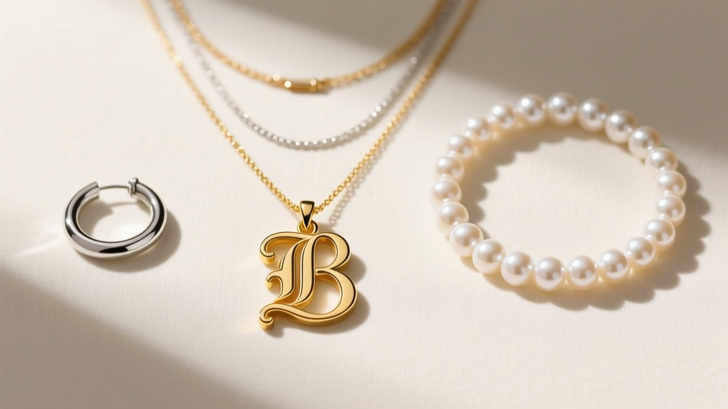
According to trend forecasters at JCK (Jewelry Circular Keystone), the most successful layering technique relies on varying textures rather than just varying lengths. Try this beginner-friendly three-piece stack:
- The Base (14-16 inches): A simple, smooth gold or silver choker, or a delicate freshwater pearl strand. This provides a clean baseline.
- The Anchor (18 inches): Your Old English initial necklace on a 1.5mm box chain. This sits perfectly in the hollow of the collarbone.
- The Extension (20-22 inches): A minimalist lariat, a simple geometric hoop pendant, or a solitary bezel-set diamond/gemstone drop. This draws the eye downward and elongates the neck.
Cleaning and Maintenance: Protecting the Patina
Caring for an Old English pendant requires a gentle touch. Many jewelers use intentional oxidation (a process involving liver of sulfur) to blacken the deep grooves of the Blackletter font, making the sharp silver or gold peaks pop with high contrast.
Warning: Never put an intentionally oxidized Old English pendant into an ultrasonic jewelry cleaner. The high-frequency vibrations and harsh chemical baths will strip the dark patina right out of the grooves, leaving you with a flat, one-dimensional piece of metal.
Instead, clean your pendant using the "soft agitate" method. Mix a few drops of mild dish soap (like Dawn) into a bowl of warm water. Dip a baby toothbrush or a soft-bristled makeup brush into the solution and gently sweep it through the grooves of the letter. Rinse with lukewarm water and pat dry with a microfiber cloth. If you own a sterling silver piece and the grooves are tarnishing beyond what the brush can reach, use a specialized silver polishing cloth, folding the edge of the cloth to slide it into the tightest serif corners.
Final Thoughts for the Beginner
An old english initial necklace is more than just a letter; it is a piece of wearable typography that carries a distinct, bold energy. By understanding the structural quirks of Blackletter fonts— from the center of gravity on a letter 'J' to the tarnish-trapping grooves of sterling silver—you can invest in a piece that not only looks striking on day one but remains a staple in your jewelry box for years to come. Start with a versatile 18-inch box chain, choose a metal that fits your maintenance lifestyle, and let the intricate history of the font do the talking.


